All reports in Everhort offer a tabular view of the data in addition to a visual chart view. These table views are located directly underneath the visual charts.
Cell Highlighting
For reports that include a 'blended average,' the cells in the table will be highlighted in different shades of green and red to indicate how the value in the cell compares to the blended average for that period.
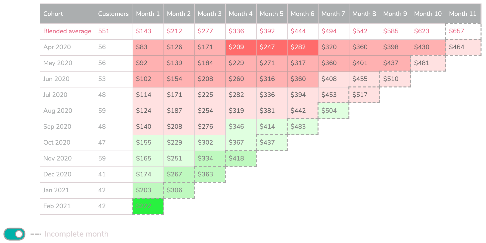
Cells are shaded based on how far the value they contain is from the average value for that period. In the example above, each cell is compared to the average value at the top of the same column.
Values that are the same or higher than the corresponding average are shaded green.
Values that are less than the average are shaded red.
In order to make it easier to discern which cohorts and which periods are performing best, and which are not, the shades of green and red will be softer for values closer to the average, and stronger for values farther away from the average.
More specifically, values grouped into buckets based on whether they are within 1, 2, or 3+ absolute deviations of the mean

Incomplete Periods
Most reports in Everhort give you the option to include or exclude the current period that is in progress and is not yet complete, using the toggle switch below the chart or table. In tables, cells that represent data from periods that are not yet complete are highlighted with a dashed border

Download CSV File
Every tabular report in Everhort can be downloaded to your computer as CSV file using the link underneath the table on the right hand side